Brand Development
Tamaiti Healthy Homes
The Tamaiti Healthy Homes brand weaves together Tangata Whenua and Tangata Moana narratives, reflecting the partnership between Te Puawaitanga ki Ōtautahi Trust and Tangata Atumotu Trust.
The brand had to weave togther māori and Pasifika cultures, creating a cohesive brand that spoke to both cultures.

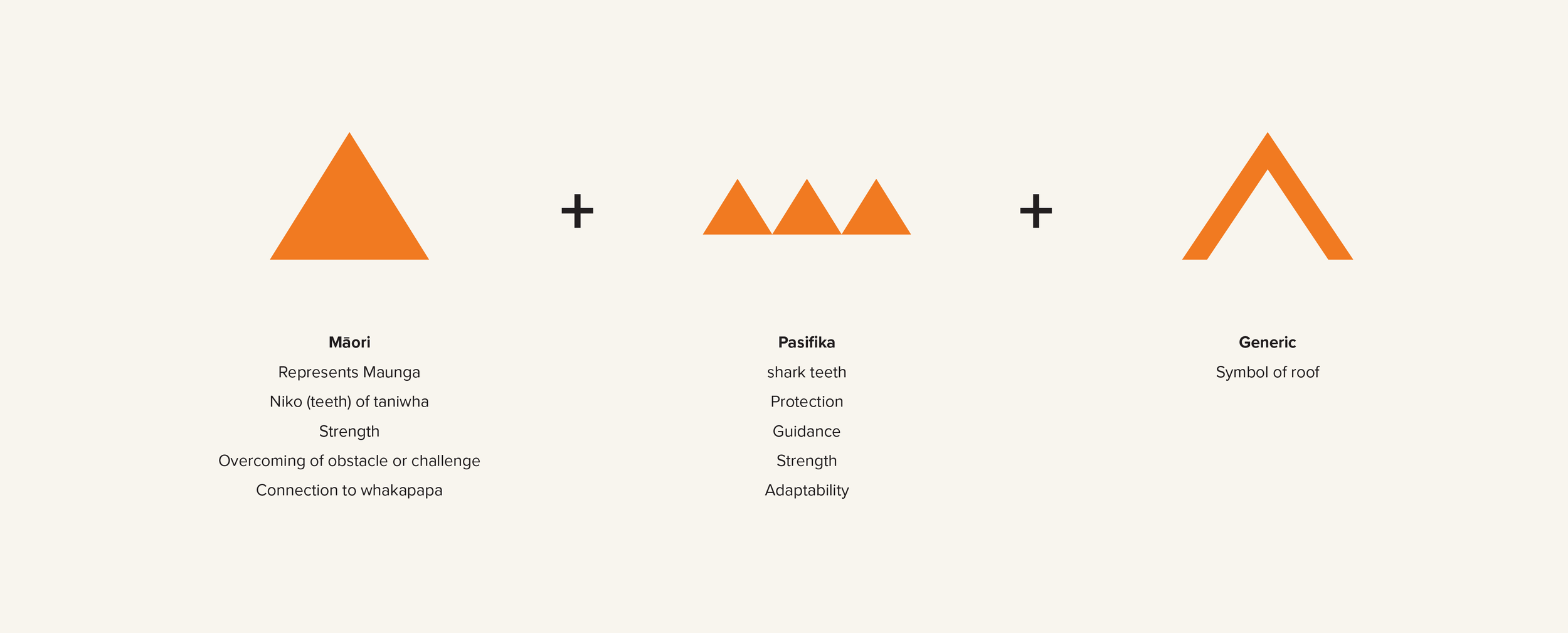

The brand is made up of three triangles – the Māori word for a three-sided object is Tapatoru, while the Samoan word is Tafatolu. The triangle shape is symbolic of Polynesia as a whole, which is the triangular area between Rapanui/Easter Island, Hawaii and New Zealand.
Triangles also represent the mountains that help connect us to our tūrangawaewae– whether that is a maunga or a significant mountain on an island. The significance of maunga is reflected in the whakataukī: Whāia te iti kahurangi, ki te tuohu koe, me he maunga teitei (Seek the treasure that you value most dearly, if you bow your head, let it be
to a lofty mountain).
In addition, in Pacific cultures triangles can represent shark teeth which can symbolise protection, strength and adaptability.
Each triangle is made up of individual lines that come together but remain independent (they don’t touch), symbolising raranga or the weaving together of two organisations that have their own unique identity, culture and purpose.
Green triangle: representing the trees and vegetation that offer sustenance and resources and provide natural beauty.
Blue triangle: representing the spiritual connection to the water shared amongst Pacific and Maori cultures.
Orange triangle: representing a connection to the soil, with the shade symbolic of the colour of tapa cloth.